Welcome Blog Hoppers! You have arrived at Katie Ehmann's blog! I have a fun challenge for you today--
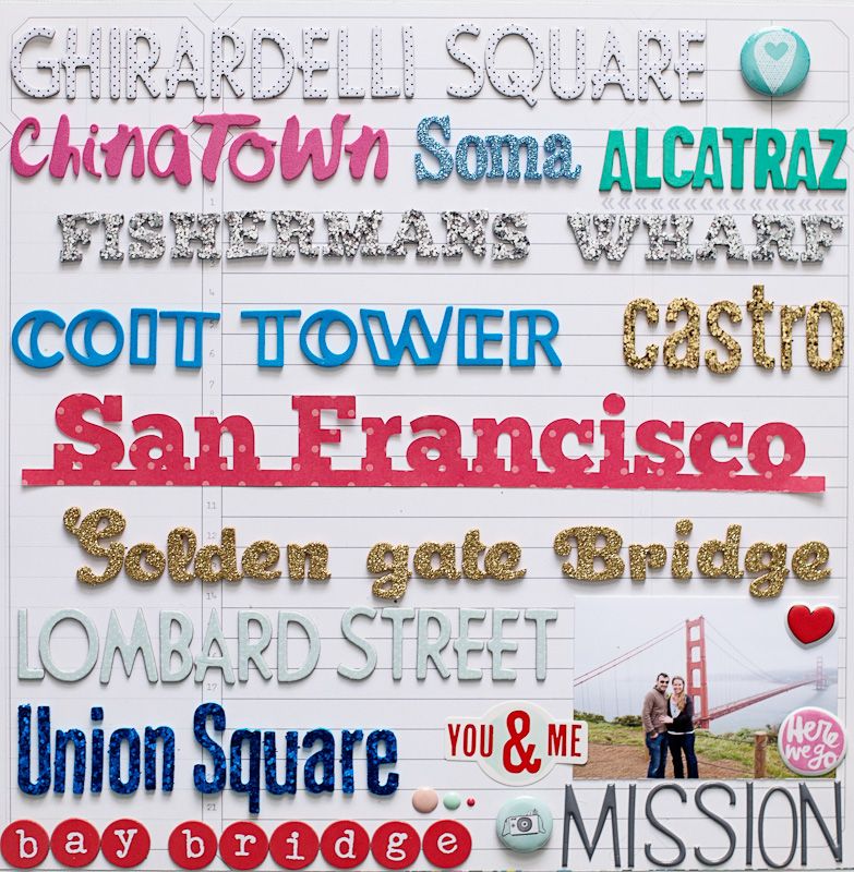
Create a layout or card with more than 3 types of Thickers!


I had so much fun creating this layout documenting just a few of the sights we visited during our recent trip to San Francisco! Next on the hop is
Elizabeth Gardner!!
And here's the whole list!
Paige Evans
Allison Waken
Patricia Roebuck
Lilith Eeckels
Ashley Horton
***Katie Ehmann***
Elizabeth Gardner
Gina Lideros
Diana Waite
Janna Werner
Heather Leopard
Meghann Andrew
Erin Stewart
Becki Adams
Angie Gutshall
Madeline Fox
American Crafts
Don't forget to comment on each blog and leave a comment on the American Crafts blog for a big giveaway!! Happy National Scrapbook Day from the American Crafts Design Team!!


 I had so much fun creating this layout documenting just a few of the sights we visited during our recent trip to San Francisco! Next on the hop is Elizabeth Gardner!!
And here's the whole list!
Paige Evans
Allison Waken
Patricia Roebuck
Lilith Eeckels
Ashley Horton
***Katie Ehmann***
Elizabeth Gardner
Gina Lideros
Diana Waite
Janna Werner
Heather Leopard
Meghann Andrew
Erin Stewart
Becki Adams
Angie Gutshall
Madeline Fox
American Crafts
Don't forget to comment on each blog and leave a comment on the American Crafts blog for a big giveaway!! Happy National Scrapbook Day from the American Crafts Design Team!!


Wow, love this layout, so bright and fun!
ReplyDeleteWhat a fun layout. Thank you for the inspiration.
ReplyDeleteHappy NSD.
Love the idea !!! Have a great day !!!
ReplyDeleteAMAZING layout! Super effective using the different thickers for the different places!!
ReplyDeleteWow, never saw this effect so far! Super great idea to use so many different thickers and decorate a whole layout with them. Something new!
ReplyDeletethat is a great way to sum up highlights of a trip or places visited thanks for the inspiration
ReplyDeleteWow! Fantastic impact. This layout is just amazing, thank you so much for sharing!
ReplyDeleteThis is amazing! You fit all the words on this page with such perfection! The OCD in me loves that! This is such a great way to use up alphabet letters! Thanks for inspiring me today!
ReplyDeleteWhat a beautiful layout! The mix of Thickers is just fabulous!
ReplyDeleteVery beautiful and original!! PERFECT DESIGN!! 3<3<3<3<3 Claudia, minimili.blog@gmail.com
ReplyDeleteGreat use of Thickers!!
ReplyDeleteYou have a beautiful style on your layouts!
ReplyDeleteWow, now that a great title!
ReplyDeleteGreat idea! I definitely want to try this! Thanks for sharing!
ReplyDeleteGreat way to use all those wonderful Thickers!!!
ReplyDeleteoh my - I just love all those Thickers!! Great use of them on your page.
ReplyDeletewow... love how you used the thickers
ReplyDeleteVery original LO, but I always have lots of pictures on mine! Greetings from Belgium, Annelies
ReplyDeleteWhat a fun layout and challenge!! I will definitely try to do this one!
ReplyDeleteGorgeous! Thanks for the inspiration and all the NSD fun!
ReplyDeleteCarol B
ciaoitalia2007(at)gmail(dot)com
Love this idea - looks so fun and a great way to sum up a trip where you saw lots of sites!!! Thanks for sharing!!
ReplyDeleteOh how fun! I love it! It would be hard to part with so many THickers, but worth it I think!
ReplyDeleteThis is an awesome challenge love your layout! Happy NSD :)
ReplyDeleteSuper creative! Happy NSD!
ReplyDeleteWow! This is so stunning!
ReplyDeleteLOVE this! How fun and creative with all those fonts and colors!!!
ReplyDeletehousesbuiltofcards@gmail.com
www.housesbuiltofcards.blogspot.com
WOW great use of thickers and I got the loads! Need to use um up!
ReplyDeletecool idea, thank you for the inspiration, and happy NSD! :)
ReplyDeletesuch a great way to use thickers! creative!
ReplyDeleteFantastic idea and design!!!
ReplyDeleteCute idea for a page! Love it!
ReplyDeleteLove all the title work and love San Francisco!
ReplyDeletewhat a FANTASTICALLY eye catching page--LOVE it!!
ReplyDeleteSuch a stunning page, I love it!
ReplyDeleteGREAT IDEA! I love it!
ReplyDeleteWow, this really is such a great way to do a page documenting a trip. And I love typefaces, so this is very inspiring to me. Happy NSD. :-)
ReplyDeleteJanice
This is an awesome challenge! I have a huge Thicker collection and I can't wait to try this!
ReplyDeleteI am in love with this! I pinned it! happy day!
ReplyDeleteSuch a dramatic page with all
ReplyDeleteHoly cow! That's amazing! What a great way to use up some of the older alphas I have :)
ReplyDeleteA very busy lo but it so works!
ReplyDeleteThis is Thicker goodness at its best, love your layout!
ReplyDeleteGreat work. I tried doing a wordy layout and have a hard time getting everything straight. You did it very well.
ReplyDeleteI absolutely 100% adore your layout. This is AWESOME! Pinned and i will absolutely be scraplifting this! Hope you had a great NSD!
ReplyDeleteFun challenge! Happy NSD!
ReplyDeleteWhat a fun page and great idea to capture memories!
ReplyDeleteWOW!! FUN, FUN, Fun!
ReplyDeleteLoving the different lettering and fonts - love love.
ReplyDeleteI love subway art and this is a scrapbook page with subway art! It is fantastic - guess I will be getting out all my alphabets!
ReplyDeleteLove your work!!
ReplyDeleteWOW - I LOVE this!! Such a great idea!
ReplyDeleteThis is really gorgeous. I suddenly feel the urge to put a major dent in my Thicker supply!
ReplyDeleteThis is amazing inspiration. I am all over this challenge to use up Thickers. Instant subway art!
ReplyDeleteWOW This is stunning! Love love love those thickets!
ReplyDeleteWow, that is a lot of alphas, what a showcase piece! x
ReplyDeleteHoly alpha's, that took some time. great layout. lots of detail.
ReplyDeleteI struggle with mixing Thickers, so this is the perfect inspiration! Amazing job!
ReplyDeleteSuch a clever idea! Love the use of different alphas as the focus of your layout.
ReplyDeleteImpressive idea for using a mix of Thickers.....a neat look!
ReplyDeleteWow, what a great
ReplyDeleteway to use the thickers!
So fun and informative
at the same time.
Carla from Utah
I LOVE!!!! this idea/concept!
ReplyDeleteI used all my different alphas and thickers on this one. http://cdn.studiocalico.com/gallery_pictures/images/000/248/784/original/photo_13.JPG
ReplyDeleteThis layout is so fab, Katie!! What an awesome way to use Thickers!!
ReplyDeletelove the way you combine so many different fonts into one layout! so inspiring and time to use my thickers. Happy NSD
ReplyDeleteLove this page & a great way to use up all those letters. Happy NSD
ReplyDeleteLoving all the Thickers! So amazingly fun.
ReplyDeletei just spent some time in San Francisco. What a cute layout idea!
ReplyDeletevery creative idea, I love this!
ReplyDeleteI went to Frisco last year, I will scraplift your LO ;)
many thanks for the inspiration
Wow! Never seen a layout like this before. Given me an idea there...
ReplyDeleteTHICKERS ROCK! I need them all...never had I had more of an addiction
ReplyDeleteIncredible how great your layout looks with basically just thickers words and a picture, with minimum embellies; you actually don't need a lot when you've used all those letters. It looks GREAT! Such a different look!
ReplyDeletePaula (from over the pond) xxx
Even though they are all different kinds of stickers, they're still making for a cohesive page. :)
ReplyDeleteYou rock! This is fabulous!
ReplyDeleteWhat a fun layout! I love the variety of Alphas, thanks for sharing.
ReplyDeletegorgeous page!
ReplyDeleteThis layout is awesome, Katie!
ReplyDeleteLove the different fonts! AND San Fran!
ReplyDeleteWhat a great way to use up some old Thickers! Thanks for the inspiration!
ReplyDeleteWhat a great way to use up those alphas!!
ReplyDeleteThat looks great and I will definitely give this a try. It's perfect since I have an over abundance of Thickers. Thanks!
ReplyDeleteI love your white with dots thickers. and love the golden ones too! marta
ReplyDeleteGreat photo and layout!!!
ReplyDeleteLOVE your variety of Thickers and LOVE the CLEVER way you have used them, they really do show that your trip was an AWESOME ADVENTURE - LOVE IT ALL!!!
THANK YOU for sharing your CREATIVE INSPIRATION :)
Brilliant layout, love all the added thickers!! :-)
ReplyDeleteLove this page with all the textures and colors and spotlights the photo! Fun, fun, fun and a great way to use up those letters. Thank you!
ReplyDeleteWhat a fun idea! I love all the words on this layout...haven't seen anything like this before!
ReplyDeleteWhat a great page. Love your blog :)
ReplyDeleteI love all the thickers! Great page.
ReplyDeleteGreat way to use up our thickers! Thanks for the inspiration!
ReplyDeletePretty sure this is the coolest layout I've ever seen! LOOOOOVE it!
ReplyDeleteLuvin' this layout and all of the thickers! Nice!
ReplyDelete